Behind the Scenes | My Design Process
This post contains Affiliate Links. This means that I earn a small commission if you purchase through my links, at no additional cost to you. Please read my Affiliate Policy to find out more.
Every creative is different in how they approach their design process. I’ve been a graphic designer for over a decade now, but I’ve only been creating and selling design products for a little over a year. I thought it would be nice to give you a glimpse of my design process—from conceptualising a new product right through to creating the preview images.
The product I’m showcasing is my new design set, Summer Party Graphics, a collection of vector icons with a colourful, summertime vibe. I mainly wanted these graphics to work on party invitations, flyers and posters, as well as online in emails and on social media.
Read on to find out how I develop my products and view work-in-progress screenshots.
Idea Generation & Trends
It’s not easy to run a business if you don’t keep your finger on the pulse. While I don’t believe in simply copying current trends, it’s always wise to keep an eye on them. I’m picky about which trends I focus on. They have to speak to me and excite me to even consider developing a product, and one key thing for me when deciding to start a product is whether or not I can put my own unique spin on it.
My primary go-to resource for seeing what’s trending is the Creative Market top searched products spreadsheet. This was helpfully put together by the CM admins and allows sellers to view 100 top search terms for each month. If you are not a seller on Creative Market, you can also see what’s popular by browsing their product categories such as Illustrations, Templates and Patterns.
There are other ways to look for trends: Pinterest, Behance, Shutterstock and looking at what the designers you follow are working on. But Creative Market is where I make most of my sales and so that’s where I initially focus my research.
Around mid-January, I began looking for ideas for a summer-themed set of design resources. I wanted to create something bright and colourful, so I checked the list of top search terms and noticed that “Food” featured in the top 15 searches every month during 2020. Barbecue season is right around the corner, and even though COVID-19 has scuppered many of our party plans, it still seems that food is on our minds.
Conceptualising
I paired the two ideas of Summer and Food and came up with the idea of creating graphics centred around BBQ parties, something that me and my fiancé love to host for our friends and family. A Google search gave me the following ideas:
- Ice Cream
- Cocktails, Beer and Soft Drinks
- Burgers and Hotdogs (plus veggie options!)
- Sauces (Ketchup, BBQ Sauce, Mustard)
- Skewered Meats
- Salad Bowls
- BBQ Tools
This was enough for me to start sketching. First things first, I needed to decide how these icons would look and what style of colouring I’d use.
Initial Sketches
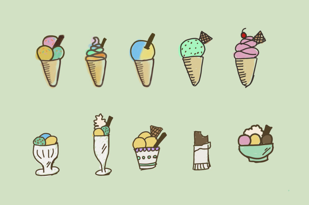
This is where I grab my iPad Pro and Apple Pencil and start sketching! This is one of the fun bits, getting rough and ready with my ideas. I never try to be too tidy at this stage, because it’s more about deciding the overall aesthetic and the different elements I want to create.

Choosing the Right Resource Types
This bit can be tricky. It’s easy to get carried away and want to create all the things: icons, social media graphics, textures, logo templates, patterns, and more (which is what I did with Celestial Beauty Design Resources). But I’ve learned that certain themes fit well with certain graphic types, and sometimes not going overboard creates a more consistent product.
Tip: if there’s a graphic type that I think is cool but doesn’t quite fit with the product, I sometimes set up a mini-product (e.g. Instagram story templates) and give them away for free at a later date.
For Summer Party Graphics, I knew that I wanted to create icons which could be used on many different surfaces and media. I decided that patterns would also work well on invitations, apparel and websites, so I included a set of seamless patterns too—all made from the food icons.
Deciding Colours
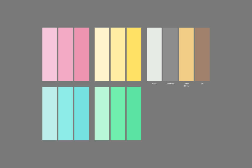
It was important that the colours in this set were bright, summer-themed and fun. I went to Coolors and Adobe Color and started to look at palettes.
In the end I went with this friendly and playful palette because it fit with the vibe I wanted to create:

Switch to Adobe Illustrator and Photoshop
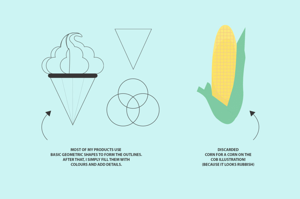
This is another fun part: vectorising the graphics. I tend to work best doing a little bit of design each day, because often my days are filled with other tasks (like growing my social media, writing blog content, checking in on my shops and seeing if I can offer value on the forums, answering emails, and other admin stuff). Mixing product creation with other tasks also slows me down so that none of my products end up rushed or sub-par.
I wrote a blog post about why I love vector design (and Illustrator) but there are other programs available like Affinity Designer and Procreate on iPad.

Once I have all of the assets drawn I save the file types and then organise them into folders, making it easier for my customers to find what they need. This part is my least favourite because it involves laying out each icon, saving it, checking the files, preparing the patterns and reducing the file sizes as much as possible without ruining the quality. It’s a little tedious but definitely worthwhile! Happy customers make a happy designer. ?
Time for the next step.
Creating the Previews
I used to hate this process because creating product previews felt like such an arcane art. I couldn’t make my images look how I wanted. It took me some trial and error before I realised I wasn’t using the right mock-ups. A little investment in this area can benefit your work—so much so that I recently wrote a blog post about creating mock-ups and preview images that sell.
For some of my illustrated products, however, I don’t use real-life mock-ups. For Summer Party Graphics I went for a bright, illustrated style on many of the preview graphics as I wanted to showcase the types of compositions people can make for their invitations, flyers and posters.

Launch!
This part is equally exciting and nerve-wracking. I love launching new products because I get an enormous sense of productivity and enjoyment from sharing my work, plus it feels great to see a project through from start to finish. But there’s always a little part of you that worries nobody will like it!
Understanding what works and what’s in demand is an ongoing process that all creatives need to think about. It changes all the time, and products that were popular last year might not be popular this year. But I believe that all trends come back around eventually.
Tip: seek evergreen topics—those things that people tend to always love and that are always in demand. Animals and food are a great example of evergreen content. They never go out of style!
So there you have my product development process from start to finish. I’m happy to answer any further questions you might have. Drop me a comment here or on my contact form.
Post preview image by Aleks Dorohovich.


Leave a Reply
You must be logged in to post a comment.